
This past month, Fareclock unveiled its refreshed, modern console look! The redesigned experience brings together seamless navigation, Global Search bar, the Reports Center, and even a theme selector, all designed to make managing your time tracking and attendance simpler and more intuitive.
You might be asking: What prompted the new design?
Fareclock has always been committed to bringing its customers and users an exceptional experience. Behind the scenes, our team is constantly piecing together ways to make time tracking and attendance management easier, more efficient, and, dare we say, even more enjoyable with Fareclock.
So, what better way to elevate that experience than by introducing a fresh new look? We wanted to bring greater convenience, simplicity, and productivity to your everyday workflow without completely changing what you already know and love.
The result? A more modern Fareclock console that feels familiar, works smarter, and makes it easier to get things done.
Who Is the New Fareclock Console Designed For?
The refreshed Fareclock console is designed to support teams and professionals who rely on accurate, accessible attendance data, including:
- Business owners who want a clear overview of team attendance, schedules, and job distributions
- Managers who conduct monthly or quarterly attendance reviews and need an organized view of workforce data
- Supervisors who monitor real-time attendance and manage workers throughout the day
- HR teams who configure worker profiles, attendance policies, and applicable rules
- Payroll teams who rely on accurate attendance records to streamline payroll processing
What Changed in the New Fareclock Console Design?
Here’s a quick before-and-after comparison of the Fareclock console, highlighting what changed and how the new design improves the overall experience.
Feature | New Experience | Old Experience |
Customizable Navigation Side Menu | Navigation Side Menu can be customized to style and format the tabs according to preference – add section, item, feature, and change color and icon. | Menu overload; Three (3) independent massive lists for Manage, Reports, and Settings. Difficult to remember which section a feature is found in. No Customize Mode. |
Global Search Bar | Now available to help you search for any console screen | None |
Feature Settings | Each feature tab available on the Navigation Side Menu now contains a Settings window | The Settings Tab contained all feature Settings separate from the Manage and Reports |
Reports Center | Dedicated Reports Center with Grid or List View option | None |
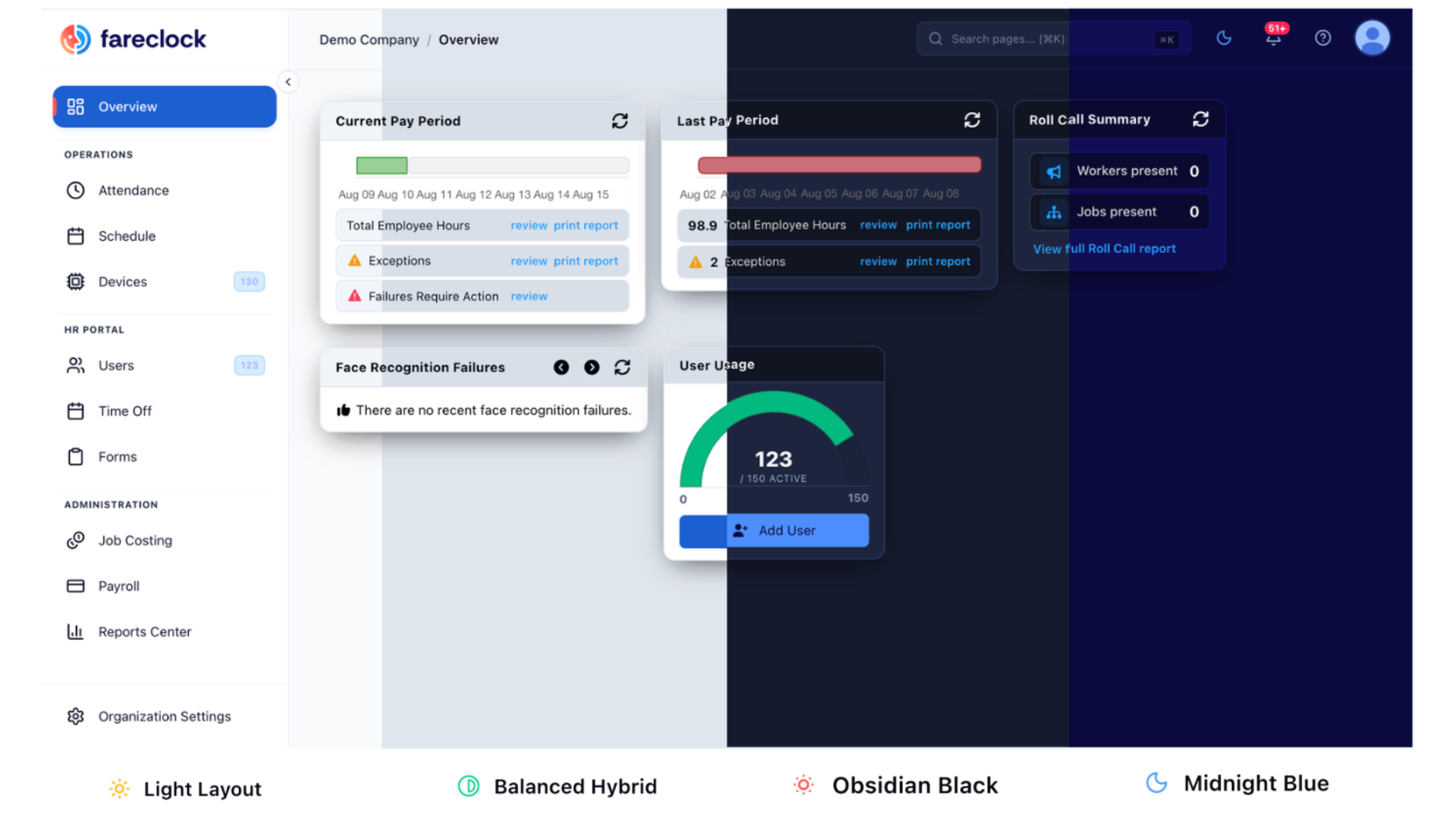
Theme Selector | 5 Theme Options: System Default, Light Layout, Balanced Hybrid, Midnight Blue, and Obsidian Black | None |
How Does the New Fareclock Console Design Benefit Users?
Here are the ways the redesigned Fareclock console makes everyday tasks easier for its users.
Customizable Navigation Menu Improves Feature Visibility
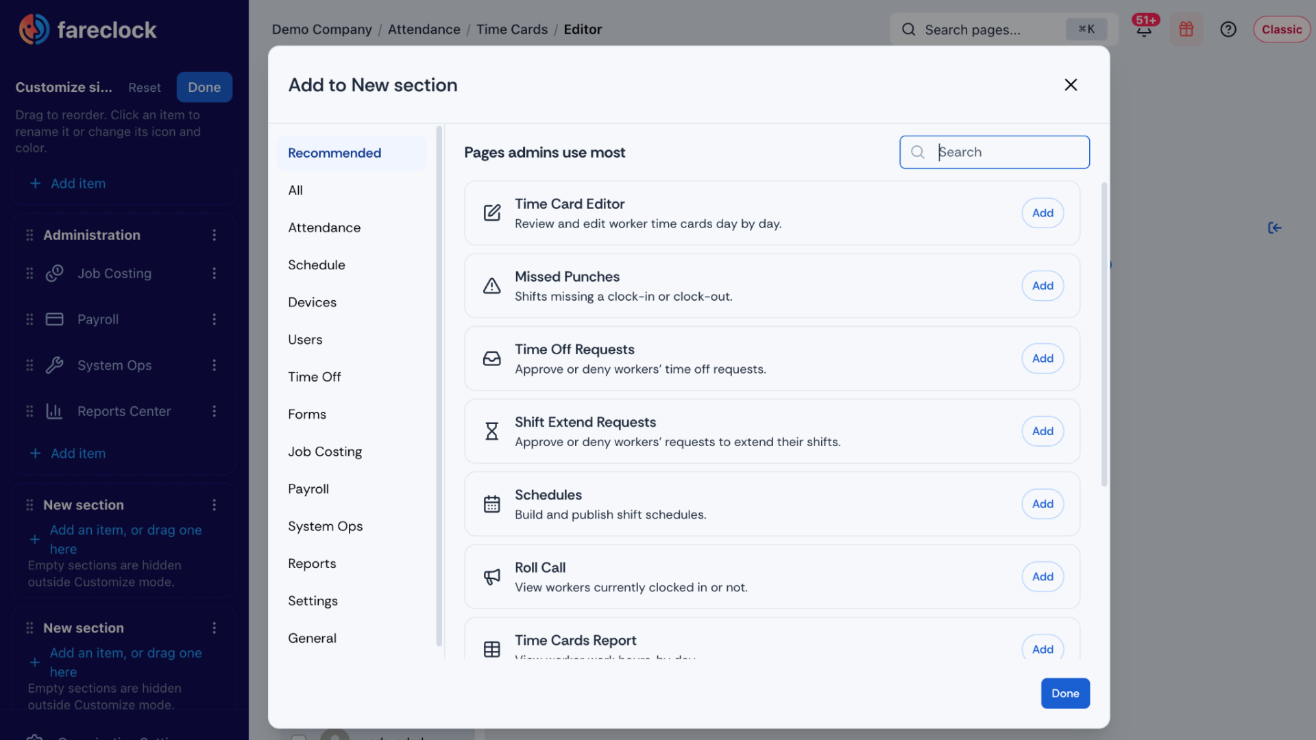
The Navigation Side Menu can now be customized to match your preferences and workflow. Add sections, items, and features, then personalize your menu with custom colors and icons. This flexibility creates a more tailored console experience, making it easier to find what you need while keeping your navigation organized and clutter-free.
Quick Search with the Global Search Bar
One of the biggest additions to the console is the new global search where you can find a screen in seconds, allowing you to get to frequently used screens more directly. Instead of navigating through menus, simply use the search bar to quickly find the page you’re looking for – a report, a setting, or another screen.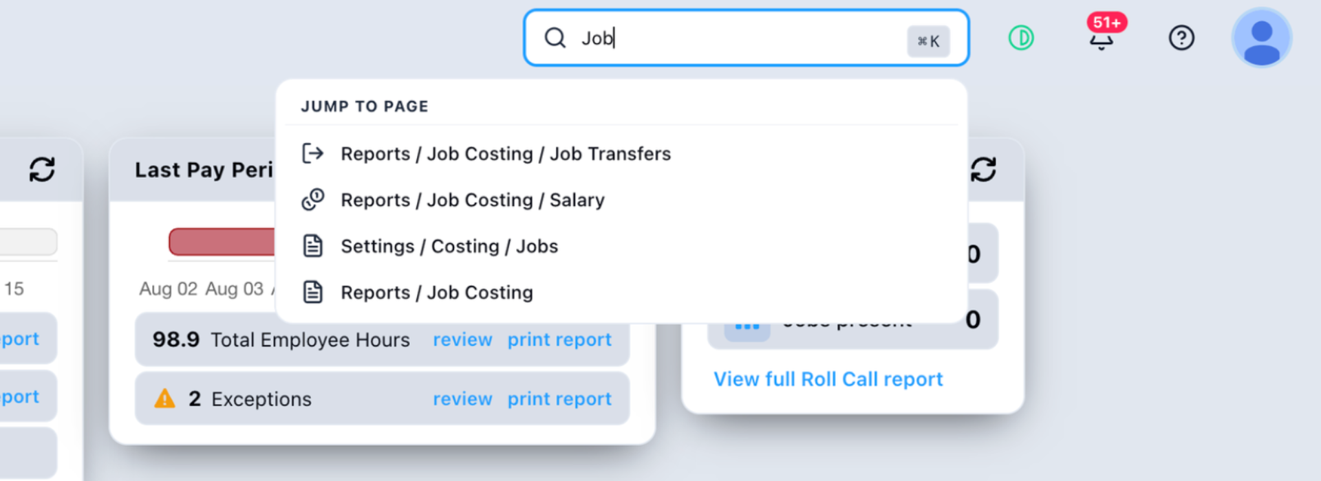
Easier Access to Related Settings
Previously, settings were separated from the features they controlled. Now, related settings are nested directly within the relevant feature, helping you quickly understand where each feature lives. This makes it easier to configure and manage Fareclock without jumping between different areas. 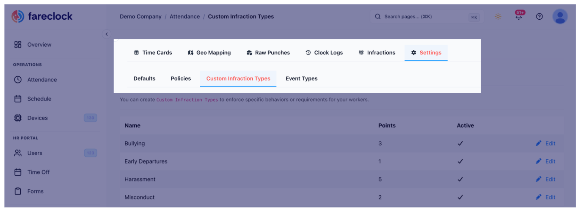
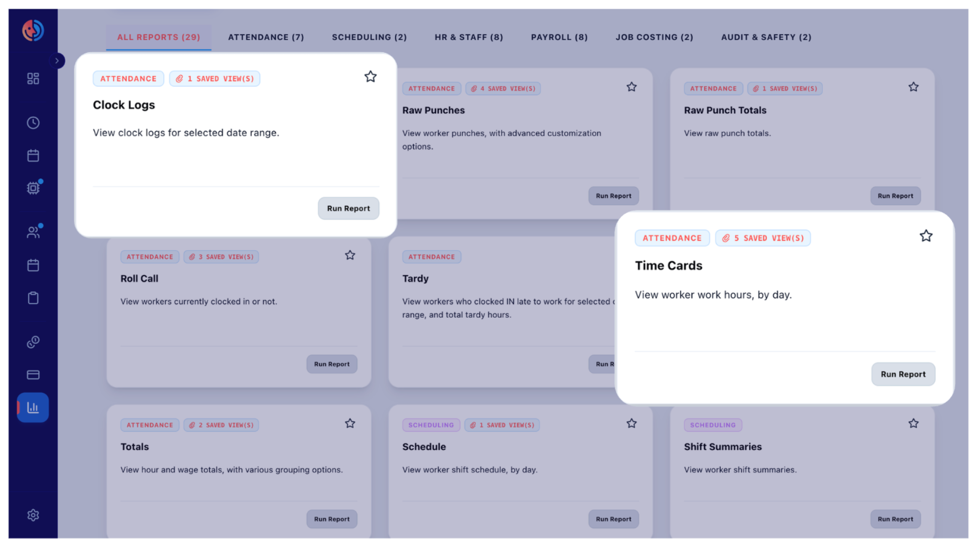
A More Organized Reports Center
Fareclock now has a dedicated Reports Center. Reports are now organized into clear categories, making it easier to find the information you need across Attendance, Scheduling, HR & Staff, Payroll, Job Costing, and Audit & Safety.
More Flexibility With Theme Selection
Fareclock also introduces a theme selector, giving you more flexibility in how you experience the console. It’s a small addition, but one that makes the console more comfortable and personalized to use throughout the day.
Can I Still Access All The Same Features?
Yes! While the console has received a refreshed look, all the features and functionality you rely on are still available. Your existing data and settings remain available and unchanged. Nothing essential has been taken away — your familiar Fareclock tools are simply organized in a more intuitive way, making them easier to find and use.
To help you get familiar with the new setup, here are a few helpful guides to get you started:
- View, edit, and manage worker schedules
- Access the Shift Settings
- Check the recorded time entries on the Time Cards
- See the active Geo Fences across work sites
- Set up Job Costing for the team
- Generate a report
- Review memorized reports or schedule a report
Do I Need To Learn Anything New?
Not at all! The new console design is enhanced to make it easier to find for features you need. It is so easy and simple that you might even catch yourself loving the new look in no time! And if you need a quick refresher, an 8-step console tour is available to walk you through the new setup.
If you run into any questions or difficulties, we’re here to help. Feel free to reach out to us at support@fareclock.com for assistance.
Frequently Asked Questions (FAQ)
1. What’s new in the redesigned Fareclock console?
The redesigned Fareclock console introduces a customizable navigation menu, a Global Search Bar, a dedicated Reports Center, easier access to feature settings, and a theme selector.
2. Can I still access all my existing Fareclock features and data?
Yes! The redesign does not remove the features or data you already use. Your existing features, data, and settings remain available.
3. How does the new Fareclock console make navigation easier?
The redesigned console makes navigation more flexible and personalized with a customizable Navigation Side Menu. You can add sections, items, and features, as well as change colors and icons to create a layout that works best for your workflow. You can also use the Global Search Bar to quickly find a specific screen, report, or setting without having to navigate through multiple menus.
4. Do I need to learn how to use the new Fareclock console?
No. The redesigned console is intended to be simple and familiar while making features easier to find. If you need help getting accustomed to the new layout, an 8-step console tour is available to guide you through the updated experience. You can also contact Fareclock Support if you have questions or need assistance.